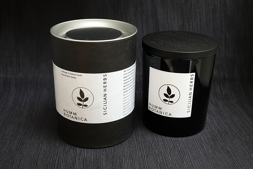
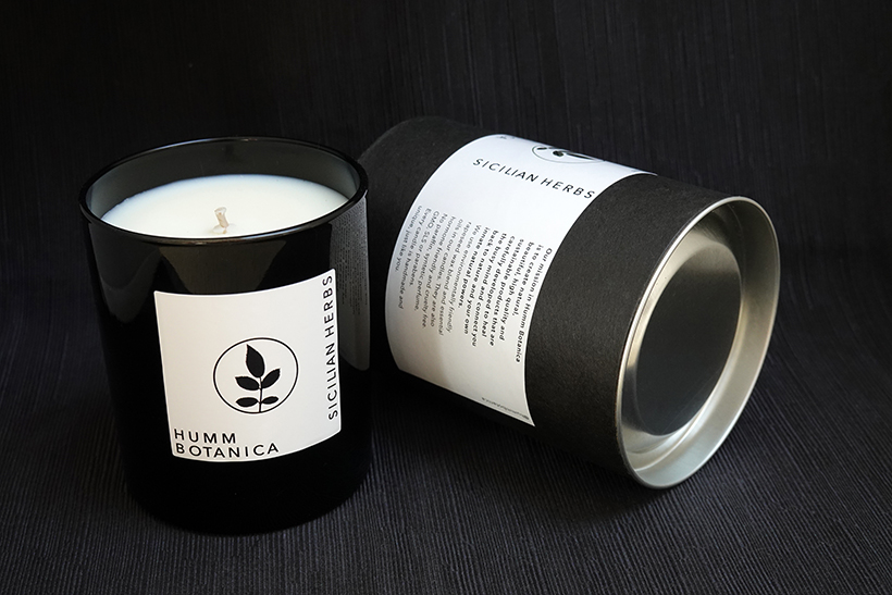
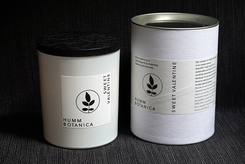
Pack Design


for my niece Aja Humm,


artisan creator


and violinist & founder


of Humm Botanica.


In fact her philosophy is:


The Fragrances


from Plants are like


Music to our Senses.


Humm Botanica’s 


products are here to


help you connect


back to Mother Earth by


creating candles, oils


and perfume from


wax and essential oils,


that are all made from


sustainable, non GMO,


non synthetic,


all-natural ingredients.

A wine-producer in the romantic village of Malans in Switzerland where castles and Gothic gardens are the setting for famous vines that stretch as far as the Rhine. Wide-open scenery - like the brief we were given without restrictions, thanks to the total trust placed in us by the client who requested a new design for their wine labels. Distinctive character and the tone of leader set them apart from the mediocre graphic design of other local labels.
We drew on an ’M’ with a cross on an old fountain in Malans for the logo of this Swiss producer, who also operates in New Zealand, redesigning

the symbol, which is the village coat-of-arms. This was to comfort our friend, the wine-producer, when he is on the other side of the world and homesick for his far-off village.

For everyday consumers, the ’M’ stands simply for Marlborough,

the part of New Zealand where these excellent vines grow.
A Swiss friend and wine-maker with a splendid estate in Tuscany over-

looking San Gimignano and a specific aim:

to avoid the traditional approach and the growing standardisation of products. He makes limited quantities of high quality wine with an innovative but classical and elegant image. He was happy with our proposals

and we are pleased that

he paid us with his wonderful wines.
Totally original packaging serving to convey a higher profile image without losing the lower bracket. The leitmotiv is a large red ’W’, also proposed for Crystall Wührer beer for reasons of synergy.
For Show Up

Crystall
Wührer Special beer
 
At the request of the Peroni Group, the leader in the Italian beer market, we accepted the very special task of creating a totally new image for a high ranking, sophisticated and trendy product for young people. For Show Up.


Restyling for the famous San Pellegrino water and Limpia still water.
The product had to be rejuvenated without sacrificing its histori-

cally consolidated identity.

Visual perception was used to convey the message that Limpia forms part of
the San Pellegrino world.

For Siverado